Logo Design & Brand identity
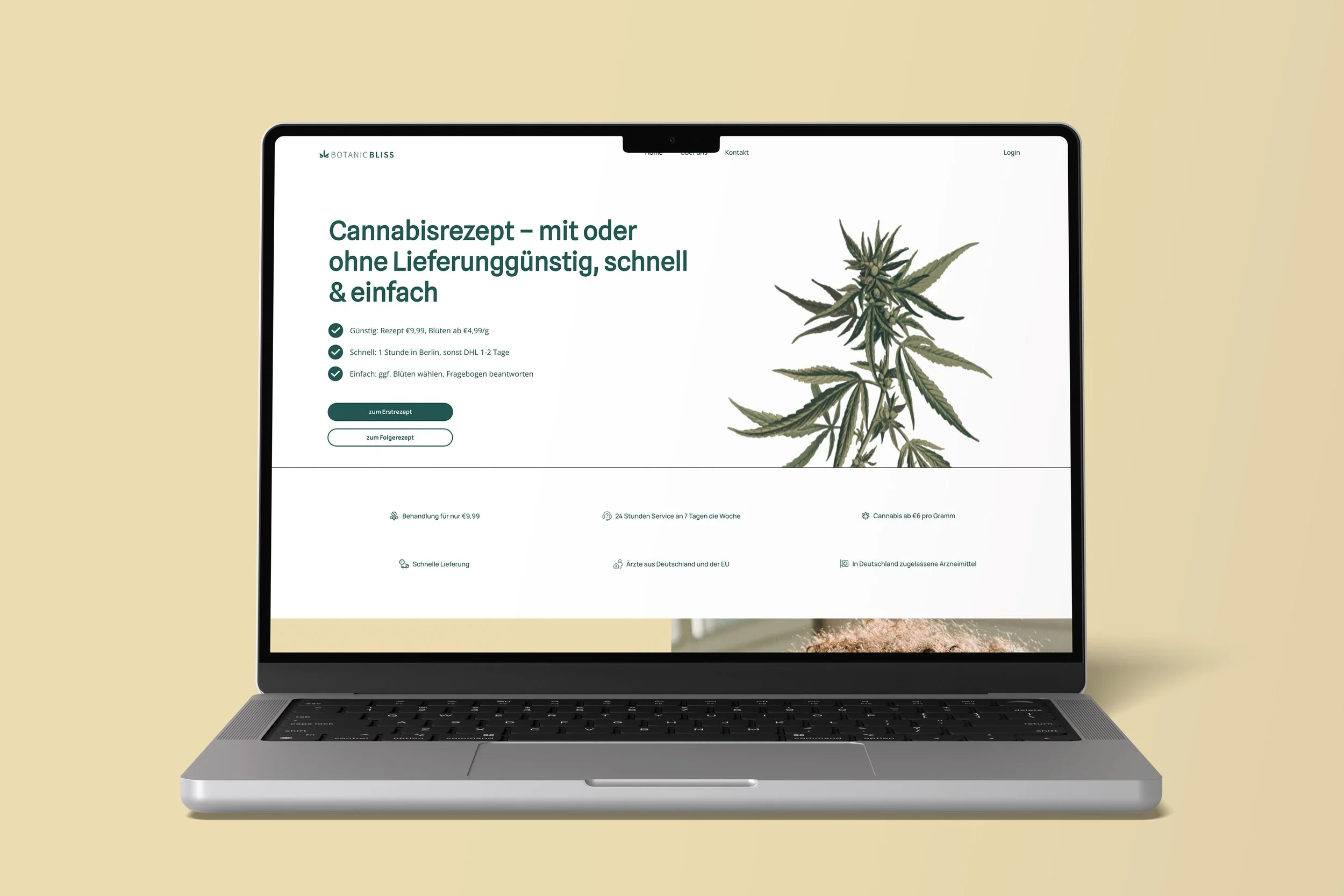
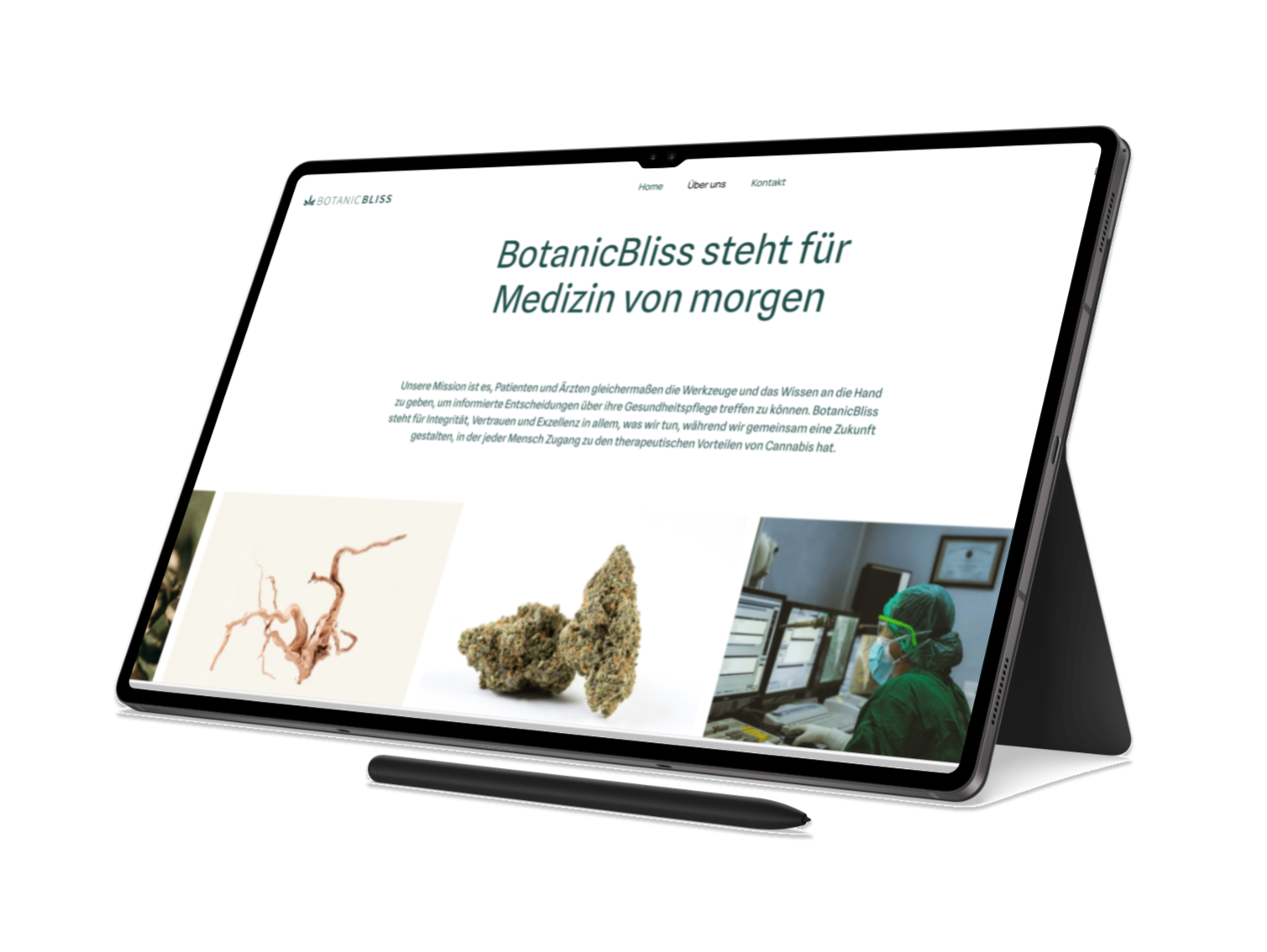
For the Botanic Bliss brand, I had the opportunity to craft a logo and overall visual identity that reflects both the natural essence and the medical purpose of their product. Botanic Bliss is a brand centered around medical cannabis, and it was important to develop a design that communicates this aspect with clarity and professionalism—while subtly incorporating cannabis imagery without reinforcing recreational or stereotypical associations.
The logo design centers on a clean, botanical aesthetic, focusing on organic shapes and earthy tones to emphasize the healing properties of nature. A stylized cannabis leaf is integrated into the logo, but it’s treated in a way that feels sophisticated and medicinal, rather than playful or recreational. The result is a design that communicates wellness, natural healing, and a trusted approach to medical cannabis.
Botanic Bliss


Mint Oil Campaign
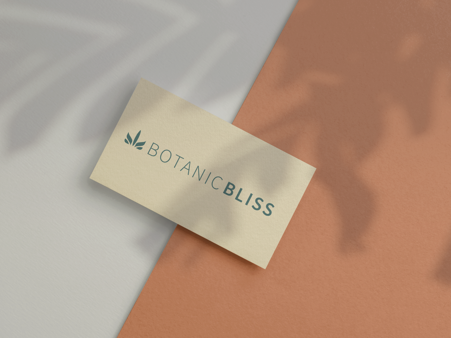
Brand Identity To maintain a strong connection to the brand’s core values—health, healing, and wellness—I chose a color palette that blends soothing greens and neutrals, creating a calming and professional visual identity. The typography is simple, yet elegant, reinforcing the brand’s credibility and seriousness in the medical space.
This design is meant to position Botanic Bliss as a trusted source for medicinal cannabis, with a focus on patient care and natural remedies. Through the logo and branding, I aimed to strike a balance between the benefits of cannabis and its role in modern wellness, ensuring that the design reflects both compassion and professionalism.